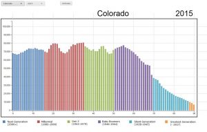
How has Colorado’s population changed in terms of age over the last 25 years, and how will it change in the coming years? Which age group claims the greatest number of Coloradans, and how will this change? These questions can be answered with a fascinating animated graph from the Colorado Demography Office. Their Age by Year Visualization presents a graph for each year from 1990 through 2040, breaking down the number of Coloradans of each age, and coloring the graph by generation to show which age groups have the highest number of persons in our state. For example, the graph predicts that by 2040, the age group born after 2000 will have by far the greatest numbers, while Baby Boomers and even Gen-Xers start to decline. Some of this is natural aging of population, but the overall numbers show a significant increase in the state’s total population and in the birth rate.

On the website, click on the “animate” button to see an animated version of how the population’s numbers and ages change over the years, or select a specific year for data from the drop down menu. Selecting 2015, for example, shows that there are more 35-year-olds in Colorado than any other specific age. Ten years ago, in 2005, the greatest number of persons were age 30. Since this is only a five-year age difference in 10 years, it suggests how much of Colorado’s population change is due to migration rather than aging. For more information on Colorado’s population growth and demographics, visit the Colorado Demography Office website.
- How to Spot the Differences Between Eagles and Hawks - August 16, 2021
- How Transportation Projects Help Tell the Story of Colorado’s Past - August 9, 2021
- Time Machine Tuesday: The Night the Castlewood Canyon Dam Gave Way - August 3, 2021