Listen to this article

This is a guest post by Tiffany Clendenin, Operations Manager at Broomfield Library.
On a recent UX panel at CALCON, I presented on website content changes that can help support our public library obligation to offer service to all patrons in a user-centered and responsive way. The following details a few aspects that can be easily adopted to create a scalable UX practice.
As a UX team of one, I took the approach of putting together a content engagement analysis of our website and used web analytics tools to determine behavior flow, time spent and bounce rate of users on our pages. This collected data gave me a snapshot as to whether or not our content was locatable and understood in any given time period. Looking only at our core user actions, I was able to determine that we needed to improve the clarity and findability of our content to better prove its value to users in the short amount of time they are on the page. You might have heard of the the 59 second rule, the average amount of time a user will remain on a web page before clicking away, but UX research actually show it’s even less than that: 10-20 seconds! That is a short amount of time to convey the value of the content and connect the user with their intended goal.
With the user in mind I developed a content strategy that I would use to reshape our content and to articulate the components of good usability that will help us to meet user expectations. Two elements of content strategy (as outlined by Kristina Halvorson in her book Content Strategy for the Web) that became a focus for me were substance and structure. With a focus on just these two elements, I found several areas needing improvement:
- Substance (topics, tone, style, what message we need to communicate). Issues were:
- Excessive information – too much to read on any one page
- Page load times – too many images
- Structure (how we prioritize and break up the content into building blocks). Issues were:
- Navigation too complex
- Not highlighting main actions we want visitors to see
Creating a logical flow with the fewest amount of clicks
The next step was to minimize/refine/prioritize the content and then map it to ensure it has a logical flow with the fewest amount of clicks. Mapping the content to improve the navigation was a quick and easy process of the most logical choices based on the whole, as opposed to a labyrinth of choices added over the years. Refining the wording and amount of description on our pages was mildly challenging but also allowed for the most dynamic changes in the page appeal. Having images is important (70% visual – 30% content) but having too many is also chaotic to the flow of the page. In places where I needed to remove images but still had text content, I focused on having a good text hierarchy to ensure that it is clean and easy to read.

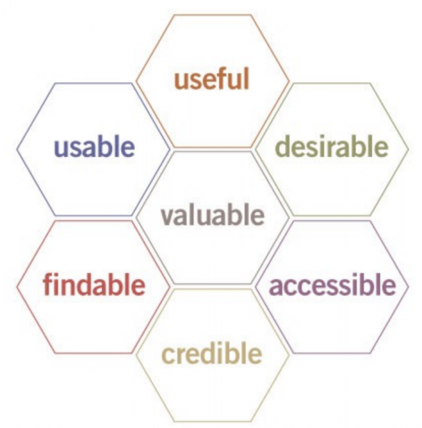
These targeted changes improved the clarity and findability of our web content in an immediate and visible way (the usage data has shown). UX pioneer Peter Morville established the seven facets of user experience which are a great guide when considering page content. Is it Usable, Useful, Desirable, Findable, Accessible and Credible? I found that these small changes were impactful to move our content more in the direction of this goal.
Equally important as the substance and structure, were the accessibility challenges in our content that would prevent access and understanding for certain users. Web standards for accessibility such as having alt text for images and descriptive text for links were common mistakes in our content (and easy to fix). Empathy building is an important concept in UX and there are web tools to simulate issues such as color blindness or tools for highlighting issues in our HTML code that would present a problem for screen readers.
The process described above took about 6 months to complete but the strategy is now a continuous process applied not only to the library’s website content, but also to other digital services and access points. Perhaps most importantly, this assessment helped to create a culture of usability in the library where we are not just pushing out information to users but instead trying to understand our users’ needs and behaviors so that their interaction with the content is a useful, and therefore a worthwhile experience.